AMTRAK
First built-in sharing feature
Responsive
Case Study
People find Amtrak's ticket search and booking process a bit of a hassle, and many end up using other platforms like Wanderu, which are simpler to navigate. This project's aim was to give Amtrak's ticket search a makeover, making it look and feel more modern. I honed in on what users really care about: making tickets flexible, comparing costs easily, and helping them understand fares better.

.png)
PROJECT TYPE
Case study
DELIVERABLE
Responsive desktop/mobile redesign
AUDIENCE
Train & bus travellers
TOOLS
Figma, Zoom
TIME
80 hours
ROLE
UX Designer
PROBLEMS & GOALS
Amtrak operates inter-city rail services across 46 U.S. states and 3 Canadian provinces, serving over 20 million travelers every year. While tickets can be booked directly through Amtrak's website, current users often report functionality issues.
My preliminary research highlighted frequent problems, including unexplained errors popping up on users' screens and a lack of alternative solutions when a direct route isn't available. Subsequent user research will aim to uncover specific pain points that users face when searching and booking tickets on the website
RESEARCH
Since Amtrak is the USA's only train servicer, there are no direct competitors. However, I considered what could be learned from similar train and bus ticket sales sites including Greyhound buses, Wanderu and Rail Europe. I then interviewed 3 Amtrak website users and 2 Google Flights users about their online ticket booking experiences. Additionally, I observed two Google Flights users providing live feedback while navigating through an Amtrak ticket search for the first time to gain insights into new users' perspectives.

CHARACTERISTICS
-
Operates the largest intercity bus service in NA
-
Website has functional search, filters, easy to read UI, lots of info about Greyhound travel
-
Responsive - mobile has the same desktop features
STRENGTHS/WEAKNESSES
-
Easy to find a trip to meet needs, like cheapest or fastest trip or trip with the least transfers
-
Access tools quickly like manage booking, ticket search, FAQs etc.
-
Could improve customer service reputation by bringing the website up-to-date
-
Big menu and well organized at higher but not lower levels

CHARACTERISTICS
-
A travel search and booking platform that browses bus and train operators across Europe and NA to find the best ticket deals
-
Car and hotel add-ons
-
Responsive - mobile has the same desktop features
STRENGTHS/WEAKNESSES
-
Users report Wanderu is their preferred way to book Amtrak tickets - it's simpler, has a cleaner UI and feels less fuss-free
-
Often has available Amtrak tickets whenever Amtrak's own website doesn't
-
Lacks some complexity e.g. a search that excludes unavailable fares
-
Can't add number of travellers to search
CHARACTERISTICS
-
Search and booking platform for train tickets and passes within Europe from multiple carriers including local and national companies
-
Detailed info about cities, routes, tickets, passes, stations etc.
-
Mobile is more focused on searching/managing/booking tickets rather than info
STRENGTHS/WEAKNESSES
-
Intuitive site that users find easy to navigate and informative
-
Good for first time travellers as has wealth of travel related info
-
No filters or price comparison
-
Could improve its multi-city search
USERS NEED...
-
a more welcoming and beginner-friendly homepage, because the current homepage tries to cram too much in and has too many attention-grabbing components.
-
more help finding useful tools, because the current site menu is huge and categories are not always labelled intuitively.
-
to be shown all available deals, fares and ticket inclusions before they book.
-
the flexibility to shop around and find the best deal.
USERS ARE CONFUSED BY...
-
bus portions of their route appearing on Amtrak, and being unable to tell which legs are by bus and which are by train.
-
a UI that doesn't highlight suitable train stations to depart from/arrive into.
-
a booking process that overall lacks organization, hierarchy and intuitiveness.

RESEARCH TAKEAWAYS
-
Users seeking faster and simpler ticket purchases require a streamlined website that prioritizes improved ticket comparison and date flexibility.
-
I will focus on improving three aspects:
-
the homepage;
-
the search feature (including results, tools and filters);
-
and the information provided to users about things like stations, tickets, destinations, fares.
-
-
The design must enable novice train riders to easily navigate the new website and confidently book tickets without relying on search and booking platforms like Wanderu.
MEET STELLA
AGE
OCCUPATION
LOCATION
INCOME
21
Student/server
New York, NY
$30,000 USD
Stella has recently moved to New York for her studies and, as expected, is living on a tight budget. The holidays are approaching and Stella would like visit family in Boston for the week. She hasn’t ridden intercity trains before, but she’s heard that Amtrak offers affordable train tickets.
The problem is, she’s looking at the website and it’s pretty hard to navigate. She’s not familiar with all the stations and it’s hard to find an available route, compare prices and deals, or find simple information that helps her understand how it all works.
It looks like 3rd party websites like Wanderu are more user friendly, but the prices are hiked. She’d prefer to purchase directly through Amtrak.com for the lower cost, if only she can figure out how to find a ticket.
savvy student
deal hunter
new rider

GOALS
-
buy cheap train tickets as needed
-
to understand tickets, fares, deals and routes
NEEDS
-
a helpful welcome homepage
-
flexibility to explore for the best deals
FRUSTRATIONS
-
she can't identify the travel mode (bus or train) well
-
she doesn't know station names to plan her trip better
-
site lacks hierarchy and intuitiveness
A PLAN TO HELP STELLA
To help create focused solutions and prioritize Stella's top problems, I conducted further analysis of research findings by creating several point of view statements. I considered which ones best reflected a range of Stella's problems, and narrowed them down to.
I chose #4 because it effectively addresses two main issues for Stella:
-
Limited knowledge about Amtrak travel.
-
The need to explore and compare tickets for the best deal.
This direction prioritizes flexibility, offering a search system that allows users to be flexible with factors like dates, prices, and departure or arrival stations.
IDEATION & FEATURES
I set a 10-minute time limit for answering "How Might We?" questions and then used analogical inspiration to refine ideas. Two key questions were:
-
How might we assist new users with flexible travel plans in finding optimal travel deals?
-
How might we ensure new users feel well-informed about Amtrak travel to confidently book directly via the website?
To select the most promising ideas and features, I defined "flexibility" through a thought exercise. Flexibility entails:
-
Allowing users to specify their preferences as broadly or precisely as desired.
-
Permitting users to leave fields blank or provide approximate information.
Areas of potential user flexibility include:
-
Dates
-
Departure times
-
Train stations or destinations
-
Price
-
Ticket class
-
Inclusions
By focusing on enhancing search flexibility and knowledge acquisition, I prioritized solutions that streamlined the search process and maximized user flexibility.
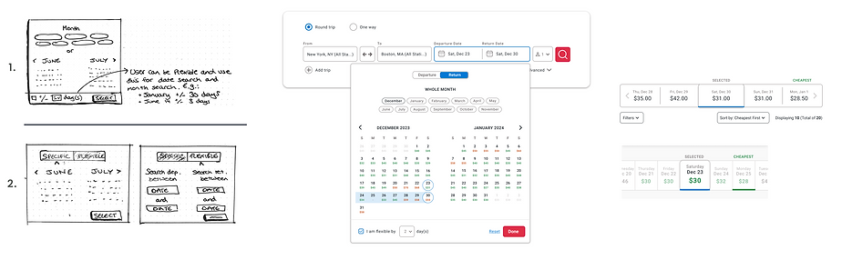
A RESEARCH EXERCISE
At this point, I wasn't sure about what to do next in the design process, so I did an exercise that involved creating a table for each thing I wanted to work on - like the homepage, search feature, search results, and route info. The example below shows the one I did for the homepage.
The table had reminders of interview findings (key goals like "no big chunks of text"), pictures of the current Amtrak site with notes on what needs fixing from interviews. I also included shots of similar features on other travel sites for design pattern inspiration, thinking about what Stella and other Amtrak users might like.

BRAND REFRESH
Due to the 80-hour scope of this project, a full rebranding campaign was not feasible. However, I refreshed the brand to go with the new search and booking look.
A HISTORY OF AMTRAK COLOURS
After researching Amtrak's historical color use, it's evident that shades of blue, red, and white/gray have been consistently employed, inspired by the USA flag colors for a patriotic touch. In 2000, however, Amtrak shifted to a more modest (almost teal) blue.
To revitalize the brand, I opted for a brighter and more refreshing cobalt blue while maintaining a warmer tone (in an effort to honour Amtrak's decision to move slightly away from the patriotic palette). The new color scheme introduces rare instances of color for practical emphasis, like red for primary CTAs and green/orange for fare coding.
TYPE
I chose the professional and legible Roboto typeface, designed for small text, ensuring clarity for tasks such as examining ticket details and comparing prices.
SECONDARY COLOURS
To meet the 80-hour project scope and focus on functional design, I made minor adjustments to the existing logo, maintaining the train track-inspired concept.
I updated the wordmark to Roboto, matching the new typeface, and rounded the corners for a softer look. Center alignment and a subtle color gradient were added to enhance visual appeal.


USER FLOWS
JOURNEY 1: SEARCH FOR A TICKET
Example scenario: The user wants to travel home for the holidays. They want to use Amtrak's search function to find the cheapest fare within a range of approximately 3 days.


JOURNEY 2: GET ROUTE/FARE INFORMATION
Example scenario: The user plans to take their first trip from a city they’ve just moved to. They aren’t familiar with the outbound train routes or Amtrak train travel in general and want to get more confident with how it works. They have questions including:
-
What's the nearest train station to their home?
-
How much the fare?
-
What do different tickets offer?
-
How long is the journey?


WIREFRAMING
SEAMLESS, INTUITIVE & RESPONSIVE HOMEPAGE NAVIGATION
I addressed user concerns about Amtrak's website menu by proposing a homepage directory with a focus on key actions like ticket management and deals. From the original directory layout sketches, I chose #3 due to its logically categorized actions (such as 'Explore' for browsing destinations and deals, and 'Learn' for Amtrak services and rewards) and for its compatibility with a responsive mobile accordion design. Additionally, I added a search bar for Amtrak's Virtual Assistant, Julie, at the mid-fidelity stage to further help users find important information.

INTEGRATING BOTH A FLEXIBLE TICKET SEARCH & DETAILED TICKET INFO
I needed to assess how the ticket search function interacted with presenting important ticket information like trip schedules, route advice, and deals. Initially, I contemplated two search options—one for tickets and another for general information—to cater to users like Stella who might want the flexibility to omit travel dates and focus solely on their route.
However, managing multiple search boxes seemed impractical, so in the next iteration, I explored integrating the information within the ticket search results. This involved considering both a tab layout and an expandable information panel on the side of the screen.

Initially, I favored the tab layout for its mobile-friendly design, but the expandable panel offers the advantage of consolidating all information on one screen for desktop users to compare route details, schedules, and tickets. However, it poses challenges for responsive design due to its desktop-oriented layout.
Despite this, I proceeded with the expandable panel because of its significant benefit to users like Stella, enabling seamless application of trip knowledge to ticket searches without constant tab-switching. On mobile, I relocated the panel to the bottom of the page to save space and implemented a feature to display only five tickets by default, with a "more" button for additional options, facilitating easier access to the panel with minimal scrolling.

ENABLING A FLEXIBLE DATE SEARCH TO FIND THE BEST PRICES
Users like Stella appreciate price indications on the calendar during date selection, so I integrated this into the design.
For desktop, I also included an option for users to specify travel date flexibility, such as within plus or minus 2 days. Since both design sketch #1 and #2 achieved the same result, I opted for design #1 due to its simplicity and fewer clicks. The travel window was then mirrored on the search results page, featuring a top panel for users to easily see prices for nearby dates and switch between them.
In the mobile design, I leveraged the ease of horizontal finger swiping and used a continuous left/right finger swipe panel on the search results page. This meant removing the flexible date window selection on the calendar as it was redundant on mobile.
USABILITY TESTING & ITERATIONS
I conducted 4 user testing sessions where I guided the user through the prototype and asked questions based on 3 goals:
-
Does the design provide good feedback?
-
Does the design give the user information to help them book?
-
Does the design offer flexibility and meet the user's need to easily find the best value ticket?
POSITIVE FEEDBACK:
-
The interface is intuitive. The search had everything they'd expect.
-
The design being centred around the cheapest ticket was a well-liked feature. Users agreed price is important for them.
-
Information is easy to find and access. Nobody had problems finding the information panel.
ITERATIONS 1 & 2:
-
“Make the flexible date search an inbuilt feature, not something that needs to be selected”
-
“Offer better flexibility to view and compare prices for a specific fare of the user's choice"
A flexible date toggle now appears on all searches, showing +/- 3 days. Furthermore, instead of only seeing the cheapest Saver fares pushed to the top of the list, users can cycle between fare types to better compare them all.

ITERATION 3:
-
Review the calendar to fit iterations #1 and #2
As the Saver fare was no longer being singled out as the most important fare type, I removed numerical prices for the cheapest Saver fare and replaced them with a colour-coded price indicator instead.
Green circles indicate the that search results will include cheaper tickets for a good deal and a good time to travel, whereas grey circles indicate normal pricing and red circles indicate higher than usual prices (for example, during peak travel periods).

ITERATION 4:
-
“Add more visual contrast to the info panel so the headers are clearer”
Section titles in the information side panel are now more obvious so that users can find information quicker expand or collapse them more conveniently.

ITERATIONS 5 & 6:
-
“Some sections should be higher or lower, like Routes should be lower”
-
“Change to expanded by default and collapsable as secondary”
The information panel is now expanded by default, giving users the option to collapse individual sections. Sections have also been rearranged to push most useful/important information to the top.
ITERATION 7:
-
“The deals section could have some more details about eligibility"
The deals section shows a few more important details for users, still prioritizing their most relevant deals. Users can open the full deal in a new tab or apply their dates to the deal to check their eligibility.

INTRODUCING A REVAMPED AMTRAK WEBSITE
The new Amtrak Home and search feature focuses on a more welcoming navigation, clearer information for beginners and a cost and deals focus.
RESPONSIVE DESIGN
Home prioritizes everything that users like Stella find most important: easy-to-find links, no extra clutter and discounts. The mobile site follows a responsive design, including almost all features and components found on the desktop version. Lacking the space for an information panel on the side of the screen, the mobile version opts for a lower panel with tabs.


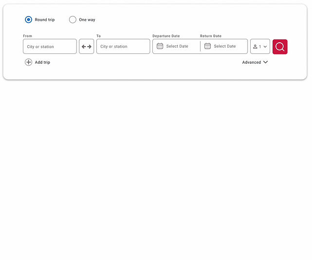
A SMOOTHER, MORE EFFICIENT TICKET SEARCH
The revised search function seamlessly takes users through its steps; providing auto-selection, form validation and other intuitive perks to ensure a seamless and quick experience.
A flexible date-selection calendar is colour coded to give the user a heads up on which travel dates are cheaper than usual (or not). Users also have the option to search for a whole month, if they want a lot of date flexibility to look for a cheap price.
PRIORITIZING COST TRANSPARENCY & THE BEST DEALS
Ticket search results offer features for effective fare comparison, including:
-
default sorting in ascending price,
-
cheapest and fastest fares highlighted,
-
a flexible date toggle for price comparison on neighboring dates,
-
the ability to search by different fare types with prioritized best deals,
-
and a total cost indicator in the progress panel.
.png)
CONVENIENT ACCESS TO A PERSONALIZED INFORMATION PANEL
A collapsible side panel (desktop) or lower panel (mobile) of useful trip information can be easily accessed from any search results page.
This panel is personalized based on the trip details entered in the search, and includes:
-
a trip overview,
-
station information in both cities,
-
relevant deals for this route,
-
routes that travel between the inputted cities.
If a user sees a deal they like, they can apply it to their booking and the total cost preview will be adjusted.

REFLECTIONS
This project was a great opportunity to hone my skills in responsive design, working on both mobile and desktop interfaces.
I faced interesting challenges, especially with components like the info panel. Adapting it to the mobile version pushed me to explore different design patterns, offering valuable insights into maintaining functionality and aesthetics across various screen sizes.